Here at DPJ, we’re all about sharing what we love. Beyond the stories that make us love downtown, we often come across things that catch our eye, tingle our senses or have us dancing in delight. “We Like…” turns a brief spotlight on the little treasures that make our day, with helpful links so you can share in the fun.

Cruzar la Cara de la Luna
Like it or not, our urban world is “by design.” The urban landscape is filled with images conceived and created by people trying to catch our attention, communicate a message, and most of the time, sell us something. Much of it is so badly conceived and executed that it creates a noisy backdrop of “blah” that barely registers in our consciousness, except as an irritation. But people, I am here to sing the praises of an instance of real design brilliance that rises so far above the crowd that you simply must take an extra minute out of your day to stop, look and swoon.
What’s got me all a-twitter and goose-bumpy? It’s an example of top-notch, world-class, divinely realized graphic genius: the drop dead gorgeous poster art for this year’s Arizona Opera season of performances. Have you seen the images? Have you stopped for that extra minute to really appreciate their brilliance? If not, now’s your chance to sit back and revel in an example of creative synergy that combines marketing vision, clean design sensibilities, and truly artful illustration to create a nearly perfect series of images that directly communicate what this season is all about. (Click on the thumbnails to enlarge.)

I am not trained in design, but when something beautiful and meaningful smacks me between the eyes and provides that elusive spasm of delight, I just have to stand up and cheer! And then I have to find out, WHO DID THAT?
I’ve long been a fan of the genius marketing minds of the Arizona Opera. I first became aware of how far above average they were when they were working with the brilliant Jacques Barbey, whose work combined photographs and surreal settings into jaw-dropping images that beautifully conveyed the power and magic that opera aspires to. The season brochures with his imagery were hugely popular over several seasons and helped bring renewed energy to the organization.

Eventually, Ryan Taylor, Director of the Arizona Opera, and his staff decided it might be time to try a whole different tack. To break through the saturated visual marketing landscape, they wanted to see what could be accomplished with a bold, simple graphic style. The challenge would be to communicate the emotional heart of the stories in a new and compelling way.
The far-flung team behind the new look includes Laura Schairer, Marketing Director for the opera; Rodd Whitney, long-time AZ Opera designer, now based in Pennsylvania; and Emiliano Ponzi, an award-winning, Milan-based illustrator. Whitney had spotted Ponzi’s work in Communication Arts, an internationally prestigious design and illustration magazine. Whitney said, “It was amazing how he could capture the essence of stories so simply. You are immediately captivated and it makes you want to know more.”
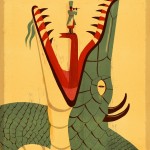
Whitney reached out to Ponzi via email and communicated what Arizona Opera was looking for. With the time differences between Italy and Pennsylvania they never actually spoke, which makes the brilliance of the collaboration even more stunning. Whitney sent him synopses of the season’s operas and placed his faith in Ponzi’s estimable talent. In a few short weeks, Ponzi sent back “nice, tight sketches” that were very close to the finished pieces. Ponzi hit the nail on the head with simple, but extremely sophisticated illustrations that catch the eye and communicate the stories with color, wit, and poignancy that matches the depth of feeling inherent to the art form.

The Daughter of the Regiment
Schairer and Whitney have worked together for nearly 20 years and the level of trust that has been developed gives them a sturdy foundation for expressing their creativity. As Whitney puts it, “When you are left to do a good job is when you can do your best work.” Schairer’s confidence in Whitney, and Whitney’s confidence in Ponzi’s talent and skill gave everyone the permission to do their best work. And what amazing work it is.
The Arizona Opera has been ahead of the crowd in recognizing the power of artful marketing for many years. With this new look, they are once again setting a very high bar that challenges every other art organization in this city to step up their game. A very low bow to everyone involved!
