
Welcome to Downtown Design, a column that will focus on the graphic design of downtown Phoenix and bring awareness to the talented designers that we have living and working among us.
Graphic Gumshoe: I-Spy Downtown Design 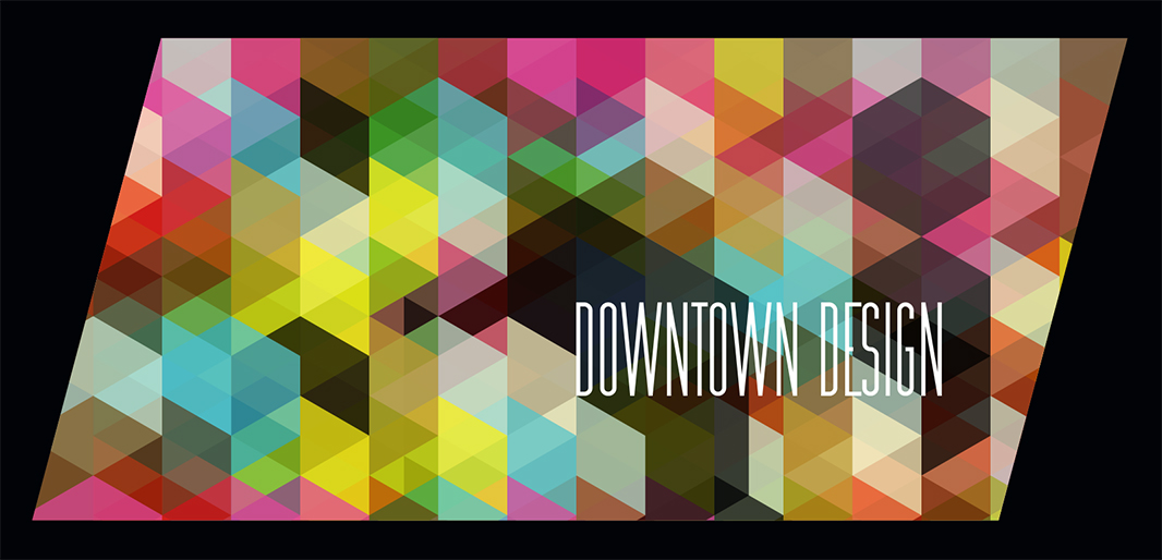
What’s wonderful about graphic design is that it’s so readily accessible. Even trekking through a seemingly “undesigned” area, such as a national park, you’ll find points of interest signage, maps, brochures, and area warning instructions, all of which was touched by the hands of a graphic designer.
The downtown Phoenix graphic design landscape is rich. There is a strong showing of hand-painted lettering, murals and sandwich boards, seamlessly co-existing with slick Adobe generated design, with perfect kerning.
With the Graphic Gumshoe, a work-in-progress photo collection of interesting Downtown Design elements, we walk around an area of downtown, take photos of the graphic design we encounter along the way and give a quick caption to each photo. Our goal is to document the graphic design landscape of downtown Phoenix as it is now, and throughout it’s evolution.
Enjoy!
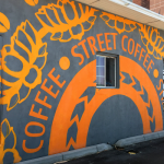
“Street Coffee” mural – 7th Street & Pierce
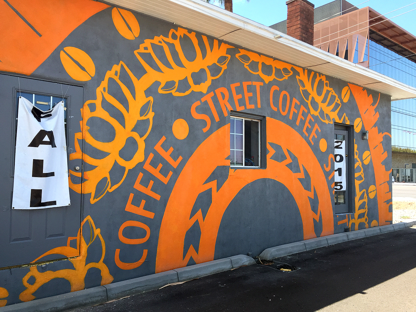
“Street Coffee” mural
The hand-painted graphic elements and typography of the Street Coffee wall art is what caught our eye and made us stop and explore this area. The bold coloring, and various graphic elements are striking and loud, but surprisingly easy to read even while driving by. Design as art to blend in with the landscape, paired perfectly with a brand new coffee shop make us eager to see what the interior design will look like and how these exterior elements will be incorporated into their packaging, signage and overall brand.
Angels Trumpet Ale House – 810 N. 2nd Street

Angels Trumpet Ale House
Angels Trumpet has their logo painted at a slight angle, which invokes motion, almost inviting you in by saying, “come on ’round the corner!” The black and white logo pops off the neutral wall just enough without screaming anymore than it has to. Their choice of graphics and fonts gives it an edgy, tattoo-quality, with added iconography to play on the “angel” aspect, and quite clearly PHX proud.
Antique Sugar Vintage Clothing – 801 N 2nd Street #104

Antique Sugar
Antique Sugar’s distressed sandwich board caught our eye for the variety of expressive fonts. The light blue board is a nice throwback color to the seemingly simpler 1950’s sweetness, which reinforces the “sugar” of their name. The solid “Antique Sugar” typeface mixed with the vintage script font, and commanding arrow, led us right over to the store for a look inside.
Bioscience High School – 512 E Pierce Street
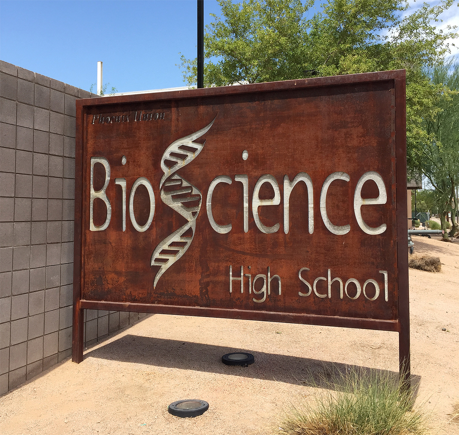
Bioscience High School
Solidly sitting outside Bioscience High School, a beautiful metal art sign incorporating their double helix mascot is a blend of refined design and organic materials. The signage alone begs you to ask more about the academics of this educational establishment.
FilmBar Lounge & Art House Cinema – 815 N 2nd Street
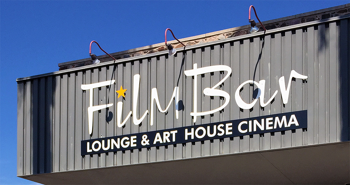
FilmBar
FilmBar’s logotype gets right to the point, playing on the mid-century modern design that was such an important part of Hollywood cinematic history. Its coloring is refined, and its overall look is just understated enough to know that you’re going to have a genuine experience, and its not kitschy, or pushed too far to come off “themed.”
Madam Helen – 715 N 7th Street
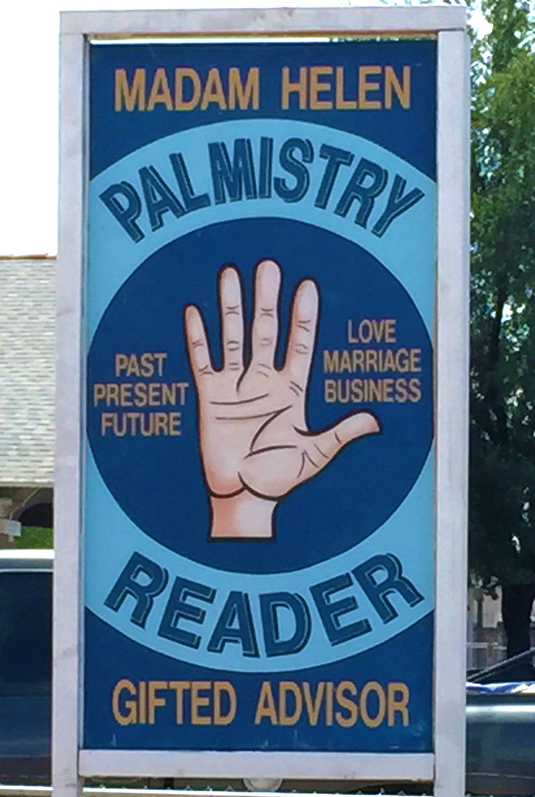 Madam Helen’s sign seemed throughly thought out and pulls you in with simplistic typography mixed with classic imagery. The colors are smart, and the image harkens back to vintage circus poster art. The mystery of her craft and longevity in the area is obvious.
Pint Ventures – 2nd Street & McKinley
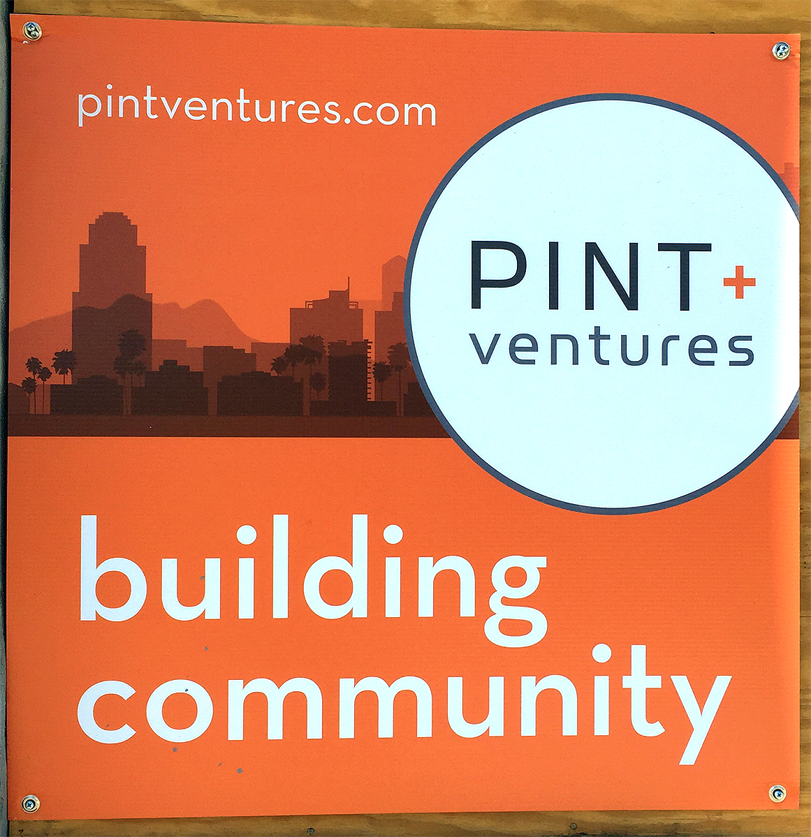
Pint + Ventures sign
A vinyl sign pinned atop plywood made a modern design statement in an area with more of a vintage flair. Something fresh is brewing, and we are interested to see what this real estate company will be doing with the space. The clean type, use of open space, and one bold color, is quickly becoming the “it” downtown Phoenix graphic look, as it can be seen in use by many of the current developers.
Photos by Rhonda Zayas.