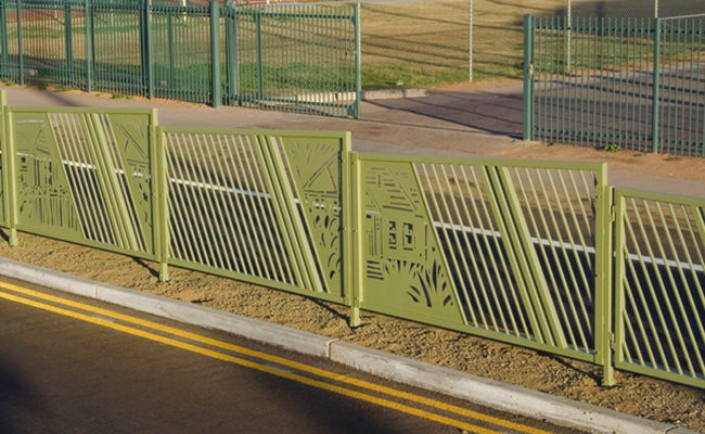
There are a lot of things out there in the world. There are a lot of spaces. Some of those spaces come very neatly constructed in organized grids with obvious purposes and expectations. They come provided to us by the organizers and planners of our city. Some other spaces are a bit looser—falling into a bit of chaos and uncertainty. In this city, they may be the vacant lots, the alleys or that little bit of land between the sidewalk and the place you want to get to. It could be the space in front of an office building or a traffic median or it could even be the area where a group of undesirable-looking people are standing. What is there to do with these unadorned, underutilized spaces?

Joan Waters’s Coronado Fence
To hem in the chaos of this nameless, frightening void enters the potential for a public art piece. A call is produced. A panel is convened. Submissions are gathered and submitted. Finalists are selected. Committees drink coffee and consider the possibilities. Suddenly, the artist has become a part of creating a sense of order and experience that is being dictated and organized by a system whose purpose is to manage the populace. The artist becomes part of generating a landscape or panorama and perhaps gives them an opportunity for their work to be seen by more people.
In the pre-film era, people came to experience moving panoramas painted onto long scrolls that illustrated historic scenes or faraway places. Moving panoramas provided an escape, much like film. Public art replaces the mundane with a more spectacular vision. Both instances fill a void with a more beautified version of what was once there and create a pleasant image on the horizon.

Sonya Ishii & Jim Hirschfield’s Overpass at Grand Avenue & Camelback Road

So, what’s wrong with things being nice? More appropriately the question might be, what’s wrong with what was once there? An artist will jump at the opportunity to conduct an ambitious project with financial support. It is the philosophy behind adorning and filling our world that is interesting. An artist, entering into a space and identifying an appropriate location of meaning is different than an institution identifying an unattractive segment of their overall urban design and its need for adornment.
Overall, we enjoy a more human-constructed beautified alternative of our landscape. The moving panorama shows us a version of our place that perhaps we’d like it to be. Meanwhile, the concept of beauty is altered from the nuances of our natural landscape, however nameless, undefined and potentially icky it may be, to a worked-over, planned presentation of our place. The vastness of the desert can be kind of scary.
Featured image: Laurie Lundquist’s “Mountain Pass Pedestrian Bridge”
Photos courtesy of the City of Phoenix Office Arts & Culture
