 From the Downtown Phoenix Partnership:
We’ve posted three new wayfinding color options and are looking forward to your opinion!
Your feedback will allow the team to finalize design development and begin to focus on programming and sign placement. Please take a look through the three options and rank them according to your preference.
Thanks so much for taking the time to provide your feedback. I’m anxious to hear from you!
Update (3/15): Survey is now closed. Results to follow.
Update 2 (3/17): There will be a meeting at the DPP offices (101 N 1st Avenue) Wednesday, March 18, from 4PM to 6PM. These new signs could be installed as early as this fall, so be sure to show up and make your voice heard!
To take the survey, follow this link. Below are some thoughts from Terry Madeksza from the Partnership:
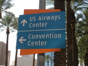
- The pilot program was very beneficial – we installed about 87 vehicular and pedestrian signs prior to the All-Star game and learned some very important lessons. (Pictures are included in the survey showing both sign types in case you haven’t seen them.) We heard from many visitors, and agree, that the color for the pedestrian signs did not stand out and were too small to capture the attention of passersby. That is why we moved away from using a darker green. We also heard that using two different sign colors (blue for vehicular signs and green for pedestrian signs) did not provide a sense that this was a cohesive system. Visitors did not make the connection that the signs were part of the same system. So – it is important for us to at least use the same color on the face panel.
- The parking signs will definitely change – we will likely move away from the number system and make the signs larger – so disregard the multiple colors on the parking signs.
- It is difficult to get a sense of the true color from looking at these slides on your computer screen. The blue used in the second slide is actually the same color as you see on the temporary wayfinding signs currently in place. The blue in the third slide is the standard blue you see on hospital signs and many street signs.
- The design team has shown a split in background sign color for vehicular signs and pedestrian signs. We can elect to have one color as the back panel for each sign type (i.e., if you don’t like the purple/orange combination, we can have the purple/green combination throughout each sign type).
- There are pros and cons to each color recommendation. The first two choices will give us a system that is unique and uses bright, vibrant colors; but they are custom colors. The third option with the standard blue is more common, but it will allow us to use resources to purchase additional signs and provide replacement signs at a reduced cost.
- Let us know your feedback – and feel free to pass this along and obtain comments from friends, colleagues, etc. We want to hear from as many folks as possible!!
Your guide as you Explore Your Core.


